ORGANIC FLOUR PACKAGING DESIGN
Organic... what a delightful word. It conjures images of the countryside, open-air dinners, and the joy of sharing an apple with an old friend. The foods we cherished in our childhood were quite distinct from what we relish today, yet their flavors linger in our memories. This is because not too long ago in the timeline of our lives, everything was naturally organic. Ponder this thought!
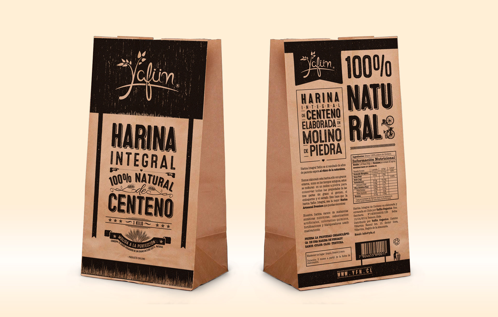
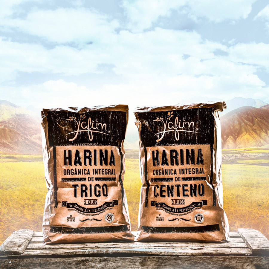
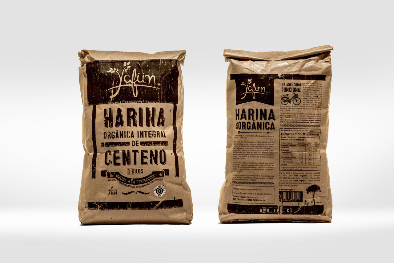
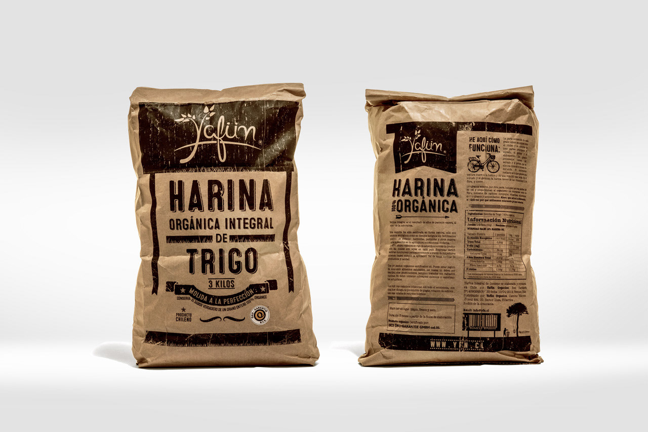
Hence, Organic Flour of Yafu?n takes inspiration from the graphic design styles of the 1900s. It was essential for the design to employ a monochromatic palette, not only for ink conservation but also to facilitate in-house production of printed packaging right at the farm where the flour is made.
Second part of the project, with and adaptation for the 1 kilo version. But what was more important, was to take off the "organic" word from the packaging and replaced it for "100% Natural".